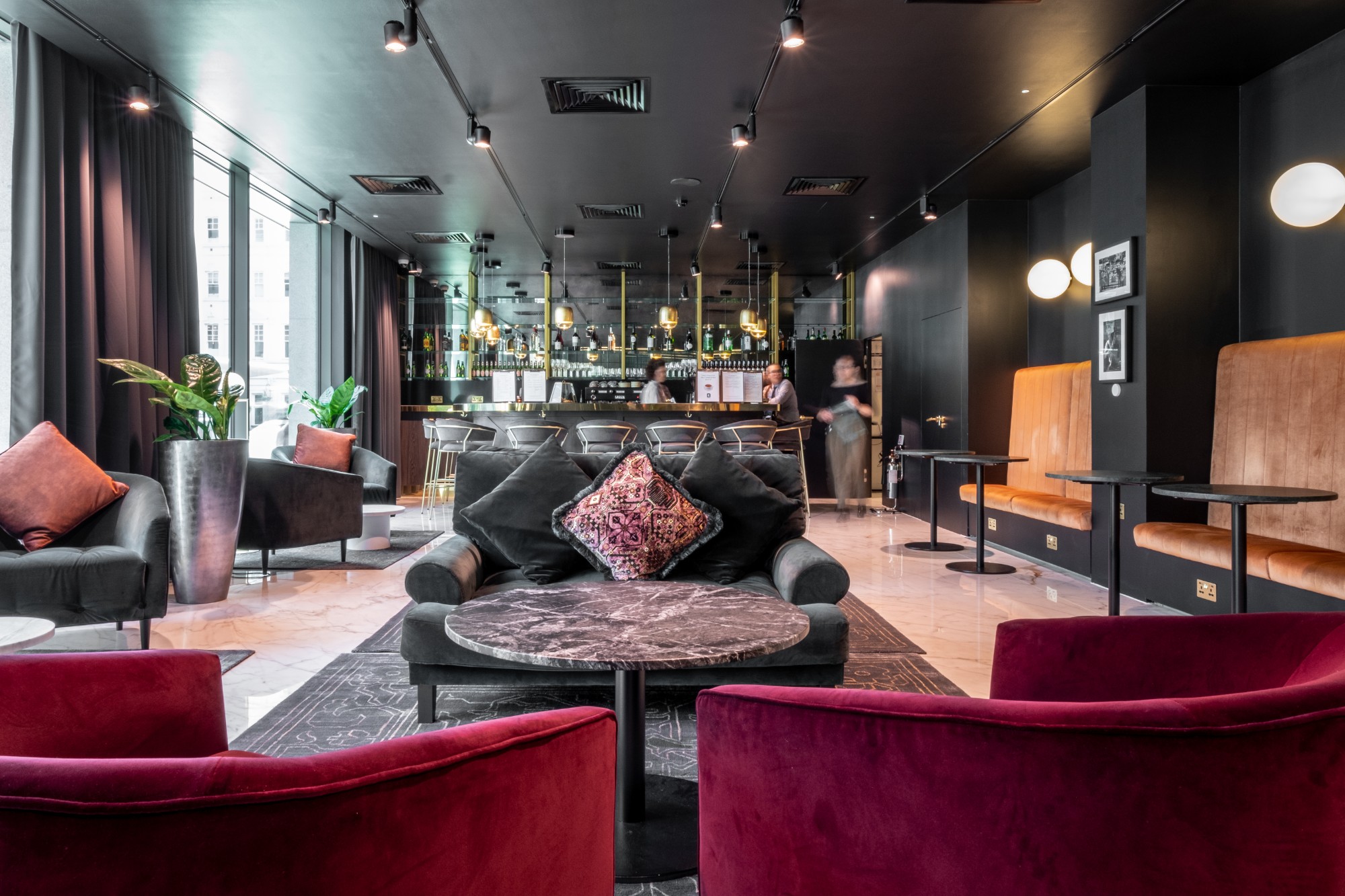
Colour plays an important role in modern life; the workplace is without exception. Consciously or Subcousiously, colour will ultimately influence both the way we feel & the decisions we make.
As office painting experts, we understand that colour psychology not only impacts how productive staff are but also impacts how potential customers perceive your business. Therefore, it’s essential to choose a colour for your office which accurately reflects your company.
Let’s take a look at some of the most common hues used in the workplace & how this has an impact.
White – This is a safe & neutral colour for a workplace, representing cleanliness & purity. Despite bringing clarity & crispness to a space, it can sometimes be perceived as boring, conventional & uninspiring. White is best used in smaller contained doses, for instance in a tea point or kitchen break out area.
Black – Black elicits feelings of control & power – which is great for creating an intimate environment. However, black can absorb natural light, therefore it’s important to consider the overall function of the space before taking this colour choice. Black would work best in lounge areas where it can provide a sense of contemporary elegance to a space.
Purple – Purple is a colour associated with luxury, nobility & extravagance. This is best used in an office alongside a neutral design backdrop, which allows the purple to shine through. However, purple can come across as being artifical, therefore it’s important to consider the overall impact of purple colouring within your office.
Green – Green represents renewal, balance & growth. Green is best used in the workplace through smaller impactful elements, for instance plant pots or feature walls. Ultimately, green will have a positive impact on employees, aiding their personal & workplace growth, simultaneously creating an inspiring work environment that promotes productivity among employees.
Blue – This is closely connected to stability, confidence & wisdom. Within an office it will effectively communicate reliability & trust to potential clients, whilst providing employees a relaxing working environment where they can produce their best work.
Red – Red invokes feelings of passion, energy & determination. This makes it ideal for use in work environments where creative work is central to the business, for instance an architecture or interior design firms. However, red can be perceived as too dominant & overpowering, therefore it is best used in the form of furnishings or partially painted rooms.
Yellow – Yellow is effective in stimulating mental activity, positivity, clarity and promoting collaboration & communication among employees. This makes yellow most effective in work environments where teamwork is central to business activities.
Orange – Orange is strongly connected to encouragement, mental stimulation & determination. Therefore, it’s most effective among a youthful workforce, for instance the back office of retail stores which have the youngest average workforce age at just 25.6. Orange is also a very bold colour which makes it very eye-catching which can make winning new clients much easier.
Our Thoughts?
When painting your office, it’s best to create a neutral design background for the rest of the space’s design. Therefore, it’s recommended that you choose a colour such as white, green or blue. These will serve effectively in creating a neutral, pure & clean workplace, whilst providing opportunities for further creativity in decorating your office space. This enables you to effectively use stronger colours such as black, red or yellow to create a bold impact on the overall space, without it becoming too overwhelming or overpowering.


